A Designer’s Guide to Choosing the Right Color for Your Exterior Home Design
Close your eyes. Imagine standing in front of your dream home, just staring at it. What color is it?
If you have no idea, you’re in the right place. This is your guide to dreaming up the perfect exterior color scheme to give your home the vibe that reflects you best. Because whether you go the DIY route or hire a professional crew, you’re ultimately the one making color choices.
So let’s dive into some exterior color palettes and paint ideas that will get you thinking like a professional home exterior designer.
Exterior Color
Many clients we work with are ecstatic about giving their home a makeover. They’re thrilled at the idea of upgrading to a new, dreamy curb appeal. But with so many color combinations, it can feel nearly impossible to choose the one you’ll feel inspired by year after year.
Nailing your home’s exterior look and feel takes strategic inspiration. Selecting the perfect color for your home exterior is more than the type or brand of paint you use. It works in combination with other architectural details like the color of your shingles and the texture of your siding (think natural wood vs. faux stone).
Like a puzzle, it’s a cohesive picture that has to fit together perfectly to create the right style home that suits you.
For example, consider this natural Siberian Larch Trespa paired with stone. Using both in warm tones gives a classic, traditional, and rich feel.

Consider Different Home Styles
If you live on waterfront or beachfront property, you may dream of brisk summer evening cookouts with sea mist in the air. If you live in the forest or the mountains, you might get excited about coming home after a long day skiing in fresh powder.
Why does this matter? Well, those two home exteriors are going to look and feel completely different.
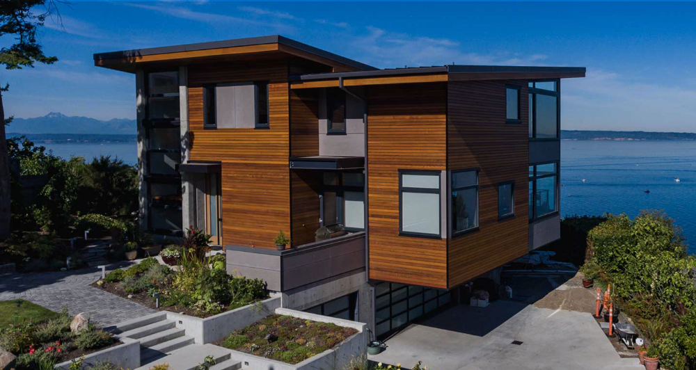
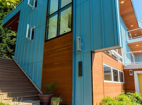
Consider the color scheme of these homes near the water.

 Sometimes (weather permitting), we can get some nice complementary colors going between the home and environment as with this gorgeous Clear Cedar Plank Home that has some lovely orange undertones.
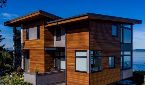
In this example of complimentary Tranquil Cerulean Blue matched lush Cedar, we can see the use of repetition at work. The cedar repeats in blocks on both sides of the home, with exciting little flashes when you look up at the soffits under the decks.
These are just a few examples of designs we’ve done, but you can see where we are going here. So when considering your overall house colors, ask yourself the following questions:
- Do the surroundings of your house influence your preferences? What is the natural setting?
- Is your home in a rural or urban area?
- What is your personal style? What are you most drawn to?
- Do you often prefer a trendy and modern home? Or is traditional and eclectic more your style?
- Does the style of your house influence your choices? Is it Tudor or Victorian? A Farmhouse-Style or Craftsman-Style Home? Cape Cod or Modern? These are just a few, but you get the idea.
Exterior Paint Color
Choosing the right material is crucial to achieving the perfect color of your home exterior. But certain materials can get expensive fast. And if there is no alternative material in the color palette you envision, what do you do?
Start painting.
More specifically, start brainstorming paint color ideas. Because if the material you’ve fallen in love with (and can afford) doesn’t come in the color you want, there is always the magic of exterior paint. With thousands of paint colors, the sky’s the limit!
But pros don’t just dive headfirst into a paint job. Achieving the right home color requires more than just knowing the difference between interior paint and exterior paint and finding the best deal between Sherwin-Williams and Benjamin Moore.
When it comes to exterior painting projects, selecting the right paint to get the home exterior color you want takes some brain work. Similar to choosing the right materials for your environment, you need to consider which exterior house paint colors are right for you, the materials you’ve chosen, your surroundings, and your situation.
Take this house exterior below, for example. Notice how the vibrant green paint plays well with the dark brown paneling.

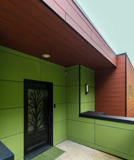
Warm Royal Mahogany paired with a cool Lime Green. These colors compliment each other and lend each other an extra vibrant pop. You can see in the sample below how different paint colors can look when placed next to a similar color vs. next to a complementary or opposite color:

Cool, right? But there are a lot of things to consider with this sort of bold approach.
- Do you belong to a homeowner’s association that may narrow your options?
- Do you have neighbors you’d like to fit in with but in your own style?
- Are you trying to resell the house?
It’s best to ask these kinds of questions before making the final decision on paint colors. If you don’t, you might end up heartbroken because you find out right before spraying the first coat that your home owner’s association won’t allow it. Or worse, you might spend double the money because you have to redo it after you already finished.
More important than whiney neighbors and association rules, though, is choosing a color scheme that inspires you. Color can be very personal. And since you are the one that’s going to be living in it, it’s always best to make color choices that bring you the most joy in life.
If you can’t find any inspiration from existing home examples, try thinking of images or concepts that bring you happiness. Often, this approach delivers the most unique, unexpected, and inspirational twists. Don’t be afraid to pull inspiration from anywhere — be it art, nature, science, or entertainment. Just find what inspires you, and start there.

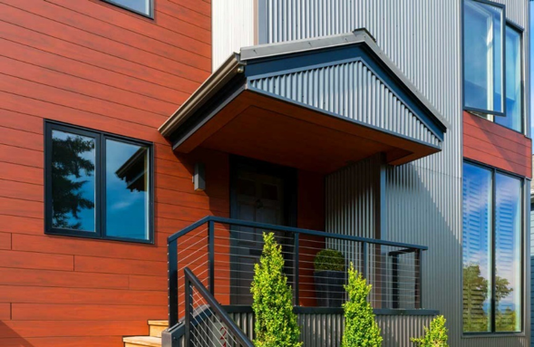
The beautiful, deep Royal Mahogany balanced with Corrugated Metal in Vintage color gives an eclectic allure, playing between traditional and modern styles.
Color Theory
Without introducing an entire lesson on design, color theory is understanding the visual effects of a specific color combination. When it comes to making the right color choices for your home, whether that’s with materials or paint, you should observe how certain colors play together.
A simple way to approach this is by asking yourself standard color preference questions.
Do you feel best around warm colors or cool colors? What about dark colors or light colors? Do you prefer bright and vibrant tones or neutral and muted tones?
Answering these questions can get your inspiration sessions going in the right direction. And if you’re like most people, you might like a combination. For example, you might feel comfortable with a majority of natural colors, but like a pop of bold accent color for a front door or trim color.
Using color theory in the choice and placement of your colors can make your design stand out. And as you explore ideas, take notice of the designs you like. Do they vary colors or use repetition? Consider how using complementary vs. similar colors may look.
One last thought to note: be aware not to overdo it. Try limiting your color scheme to two to four colors. Any more than that and your design can begin to look a bit chaotic.
Hopefully, this has given you some inspiration on how to use color, materials, and paint to bring beauty to your home’s exterior and more joy to your home. But even with guides, blogs, and articles, you may still want some expert help to ensure you get the perfect look the first time.
If that’s you, don’t hesitate to reach out to us at the Synapse Construction Design Service Department. Call us at 206.504.3162 or email info@synapseconstruction.com.
Happy Designing!